

Contact Us
- Phone number: 03-6173737
- Fax : 073-2016920
Direction
- Shimshon St 9, Petah Tikva 4952707
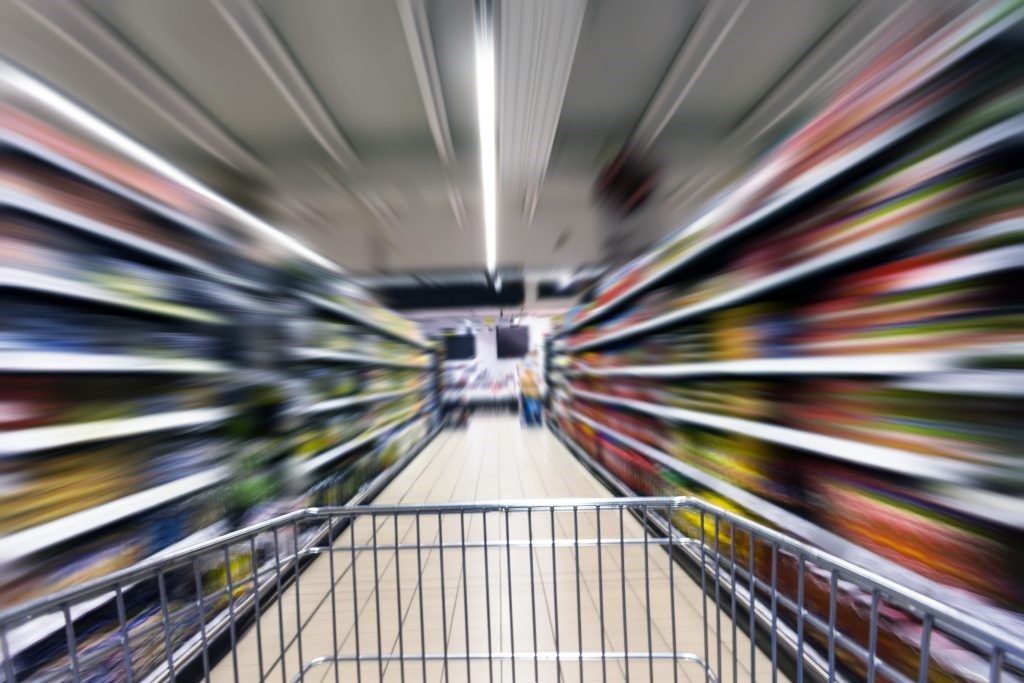
Let’s assume you’ve decided to use the rest of your lunch break to buy a few products at a nearby supermarket.
Your time is limited and you want to complete your purchase as quickly as possible.
You go in and begin to scan the shelves looking for products, but you quickly find they are laden with many different types of products. You find it difficult to locate the products you wanted and the whole thing takes a really long time.
What are the chances that you will return to that supermarket next time? Probably low.
Food sites are gaining strength
According to estimates, online food product sales will reach 20% of overall food purchases in the USA by the year 2025, with a turnover of over 100 billion dollars. An increase in the number of online food purchasers can already be seen. These figures conceal huge potential for retailers. The large food chains in Israel have also already entered the game and present advanced shopping sites and ever growing revenue from online sales.
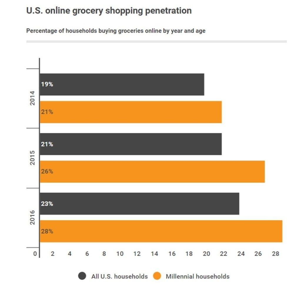
Photo credit: digitalcommerce360
What does this have to do with us?
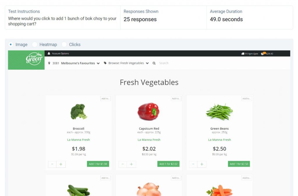
When we specify and design shopping sites, we need to assume that just as in the physical supermarket, here too our user has limited time and wants to find the products easily and quickly. Scanning time is very significant because if he or she can’t find the products they want within a reasonable time they probably won’t complete the purchase and certainly won’t return to shop at our site.
One of the issues raised during specification is the way the grid on the site’s various category pages is presented. On the one hand, we have to make sure we’re presenting enough products on each row so the user won’t have to scroll and search too much, while on the other hand the product display must be large and clear enough to make it easy to identify the product during a scan (try to differentiate, for instance, between a 250g tub of cream cheese and a 500g tub of cream cheese from a tiny picture).
There is, of course, a difference between planning commercial sites for fashion, electricity, or food products. The latter is characterized by a very large number of products being added to the shopping cart within a very short time – making the issue of speedy scanning and identifying crucial.
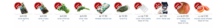
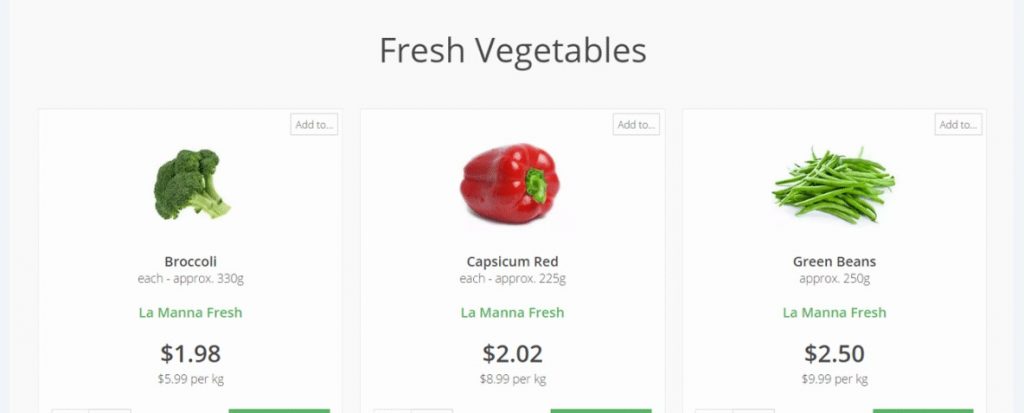
On the online Shufersal [supermarket chain] site for example, initially a large number of products was presented on every row. As a result, although the user did less scrolling – the product pictures were very small and made it difficult to locate products by scanning.
Later on, the product pictures were enlarged and the number of products on each row was reduced.
Smaller pictures, more products –
Larger pictures, less products –
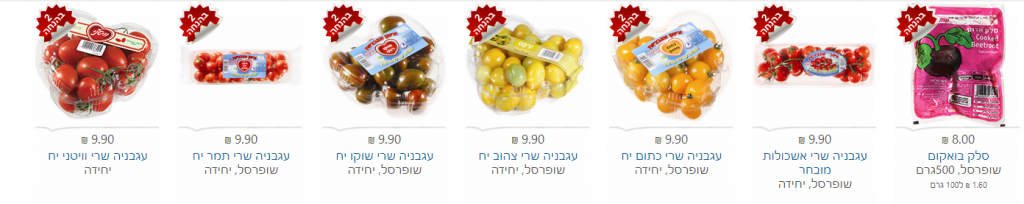
Photo credit: Shufersal online site
Number of products per row vs. picture size
A product designer by the name of Hugo Jenkins recently conducted a user test to study the impact that the size and amount of products on the grid had on the shopping / visiting time in food product shopping sites. He tested 150 users who received a ‘mission’ to find a certain vegetable on the site’s vegetable section and add it to their cart. The overall time it took them to complete the task was measured as well as the average scanning time of each product throughout the task.
The goal was to show that the bigger the product component – the shorter the scan time.
Test and results
First the optimal number of products per gridline was tested (3, 4, 5 products per line), and then the significance of the size of the products presented on the grid was studied.
Amount of products on the grid –
It was found that when the amount of products was increased from 4 to 5 per line, scanning time increased by 34% per line. This didn’t stem from the product presentation size but from adding a fifth product to the line, which significantly slowed down users’ scan rate.
Size of products on the grid –
It was found that when the product presentation was larger, the average time it took to complete the task was reduced by 10 seconds, with the average scan time per product decreased by 1 second.
In summary, it can be seen that the user’s ability to scan is influenced by the amount of products per line as well as by their size:
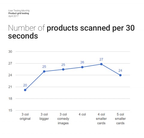
Photo credit: usabilityhub.com
What can be learned from this?
A user who enters a food produce shopping site is expecting an easy and speedy shopping experience. In order to generate an effective shopping experience, we must make sure that the user can complete his or her shopping quickly and satisfactorily and will also continue to shop with us in future.
From our experience with clients in this field, the choice between presenting as many ‘scroll free’ products as possible as opposed to showing a ventilated grid with large products and clear pictures is a real and difficult one. On the one hand, you want to expose the user to the existing wealth of products and save the effort of scrolling, while on the other hand you want to avoid cognitive overload that makes buying more difficult.
The study mentioned above shows that when we present many products per line, the user finds it more difficult to scan the products, and this in effect increases shopping time.
However, when we present a ventilated grid with larger product components, we enable a more convenient scan of a larger amount of products within a set time.